Given my rantings about digital materiality and transduction, fabrication is a fairly obvious topic of interest. I posted earlier about an experiment with laser-cut generative forms and Ponoko - more recently I've been playing with 3d-printing via Shapeways, as well as trying out data-driven (or "transduced") forms. This post covers technical documentation as well as some more abstract reflections on this project - creating a wearable data-object, based on 365 days of local (Canberra) weather data.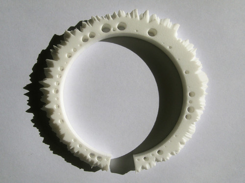
Shapeways has good documentation on how to generate models using 3d-modelling software. Here I'll focus more on creating models using code-based approaches, and Processing specifically. The first challenge is simply building a 3d mesh. I began with this code from Marius Watz, which introduces a useful process: first, we create a set of 3d points which define the form; then we draw those points using beginShape() and vertex().
The radial form of the Weather Bracelet model shows how this works. The form consists of a single house-shaped slice, where the shape of each slice is based on temperature data from a single day. The width is static, the height of the peak is mapped to the daily maximum, and the height of the shoulder (or "eave") is mapped to the daily minimum. To create the radial form, we simply make one slice per day of data, rotating each slice around a central point. As the diagram below shows, this gets us a ring of slices, but not a 3d-printable form. As in Watz's sketch, I store each of the vertices in the mesh an array - in this case I use an array of PVectors, since each PVector conveniently stores x,y and z coordinates. The array has 365 rows (one per day, for each slice) and 5 columns (one for each point in the slice). To make a 3d surface, we just work our way through the array, using beginShape(QUADS) to draw rectangular faces between the corresponding points on each of the slices.
To save the geometry, I used Guillame laBelle's wonderful SuperCad library to write an .obj file. I then opened this in MeshLab, another excellent open source tool for mesh cleaning and analysis. Because of the way we draw the mesh, it contains lots of duplicate vertex information; in MeshLab we can easily remove duplicate vertices and cut the file size by 50%. MeshLab is also great for showing things like problems with normals - faces that are oriented the wrong way. When generating a mesh with Processing, the order in which vertices are drawn determines which way the face is ... er, facing... according to the right hand rule. Curl the fingers of your right hand, and stick up your thumb: if you order the vertices in the direction that your fingers are curling, the face normal will follow the direction of your thumb. Although Processing has a normal() function that is supposed to set the face normal, it doesn't seem to work with exported geometry. Anyhow, the right hand rule works, though it is guaranteed to make you look like a fool as you contort your arm to debug your mesh-building code.
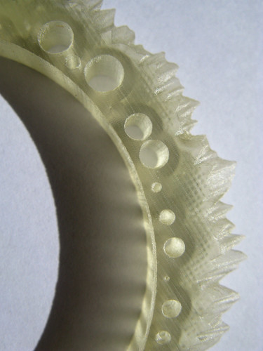
The next step in this process was integrating rainfall into the form. I experimented with presenting rainfall day-by-day, but the results were difficult to read; I eventually decided to use negative spaces - holes - to present rainfall aggregated into weeks. Because Shapeways charges by printed volume, this had the added attraction of making the model cheaper to print! The process here was to first generate the holes in Processing as cylindrical forms. Unlike the base mesh, each data point (cylinder) is a separate, simple form: this meant I could take a simpler approach to drawing the geometry. I wrote a function that would just generate a single cylinder, then using rotate() and scale() transformations made instances of that cylinder at the appropriate spots. Because I wanted the volume of each cylinder to map to rainfall, the radius of each cylinder is proportional to the square root of the aggregated weekly rainfall. As you can see in the grab below, the base mesh and the cylinders are drawn separately, but overlayed; they were also saved out as separate .obj files. The final step in the process was to bring both cleaned-up .obj files into Blender (more open source goodness) and run a Boolean operation to literally subtract the cylinders from the mesh. This took a while - Blender was completely unresponsive for a good few minutes - but worked flawlessly.

Finally, after checking the dimensions, exporting an STL file from MeshLab, and uploading to Shapeways, the waiting; then, the printed form. I ordered two prints, one in Shapeways' White, Strong and Flexible material, and the other in Transparent Detail. You can clearly see the difference between the materials in these photos. The very small holes tested the printing process in both materials; in the SWF print the smallest holes are completely closed; in the TD material they are open, but sometimes gummed up with residue from the printing process (which comes out readily enough). Overall I think the TD print is much more successful - I like the detail and the translucency of the material, as well as the cross-hatched "grain" that the printing process generates.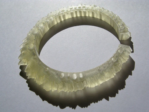
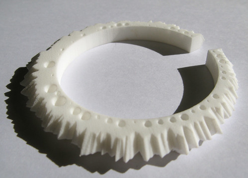
So, a year of weather data, on your wrist - as a proof of concept the object works, but as a wearable and as a data-form it needs some refinement. As a bracelet it's just functional - the sizing is about right, but the sharp corners of the profile are scratchy against the skin. As a data-form, it could do with some simple reference points to make the data more readable - I'm thinking of small tick-marks on the inner edge to indicate months, and perhaps some embossed text indicating the year and location. More post-processing work in Blender, I think.
Another line of development is to do versions with other datasets - and hey, if you'd like one for your city, get in touch. But that also raises some tricky questions of scaling and comparability. The data scaling in this form has been adjusted for this dataset; with another year's data, the same scaling might break the form - rain holes might eat into the temperature peaks, or overlap each other, for example. A single one-size-fits-all scaling would allow comparisons between datasets, but might make for less satisfying individual objects - and, finding that scaling requires more research.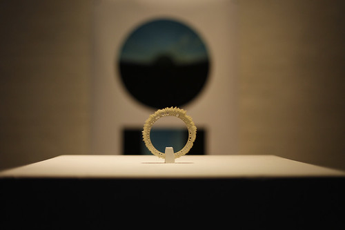
What has been most enjoyable with this project, though, is the immediate reaction the object evokes in people. The significance and scale of the data it embodies, and its scale, seem to give it a sense of value - even preciousness - that has nothing to do with the cost of its production or the human effort involved. The bracelet makes weather data tangible, but also invites an intimate, tactile familiarity. People interpret the form with their fingers, recalling as they do the wet Spring, or that cold snap after the extreme heat of February; it mediates between memory and experience, and between public and private - weather data becomes a sort of shared platform on which the personal is overlayed. The form also shows how the generalising infrastructures of computing and fabrication can be brought back to a highly specific, localised point. This for me is the most exciting aspect of digital fabrication and "mass customisation" - not more choice or user-driven design (which are all fine, but essentially more of the same, in terms of the consumer economy) - but the potential for objects that are intensely and specifically local.
Wednesday, October 07, 2009
Weather Bracelet - 3D Printed Data-Jewelry
Posted by Mitchell at 1:00 pm
Labels: data, fabrication, jewelry, materiality, processing


14 comments:
Thanks for such wonderfully detailed documentations of this process..a great example that open and transparent processes are just as critical as open data and technologies.
I think that the next step would be that you use it as a way to show the weather dynamically, as having something moving inside as like a 3 or 7-day temperature scale. So you could feel the weather, instead of looking at a series of numbers.
Also, that if you could line up a series of them ( almost like a quipu ) then people could see trends in climate in regards to their area, versus numerical data.
Mitchell,
Nice work! One possible way to make the data more comfortably wearable might be to create (build) a wafer of each data slice with a small hole added to the center of each slice. String them on a wire rope to make a necklace. The rainfall data might be added as color. A gradient from one color to another, such as blue for wetter days, gold for drier days.
-Craig
Beautiful and unique. Know several weather people who would love this.
It would be great to see some pictures of somebody wearing it...
Great Work! And great post!
I think you need to open a shop on etsy!
Wow. Can you help me better understand how the data is collected and distributed to the bracelet? Does the bracelet need to be directly exposed to weather every day or is the data interpreted by other means? In any case, this is the coolest thing I've seen in a looong time. Cheers to you.
It is very beautiful, very unique .. but I'm not sure that many people like it that way. Although it has this really cool transplantation with the right lighting, I think this color and finish that people will rather not want to wear it. Well, how complicated is to give to it some color and decoration? :)
Science Cheerleader - thanks! The data is just downloaded from the local Bureau of Meteorology, they provide it as a spreadsheet. I use Processing to read in that data and generate the form.
Any chance that you'd produce and sell these bracelets for different locations? I'd be interested in buying one from you.
Wow those bracelets are amazing! and so fashion! i want them! hehe! thanks for the good blog!
This is some very future looking jewelry ,i really like how it looks,Do you got any details where i could get one?
Thanks for such wonderfully detailed documentations of this process..a great example that open and transparent processes are just as critical as open data and technologies.
This is a great piece of work, it's like a work of art, very unique bracelet.
Post a Comment